![[管理画面フォーマット制作編 #5] ユーザープロフィールUI ─ 情報確認・編集・パスワード変更](/_next/image?url=%2Farticles%2Fnext-js%2Fuser-profile-ui%2Fhero.jpg&w=3840&q=75&dpl=dpl_EDkazoJ2F23U22ccjw3z3ZjTF1EH)
管理画面フォーマット制作編 #5ユーザープロフィールUI ─ 情報確認・編集・パスワード変更
管理画面に「プロフィール」ページを追加し、ユーザ自身が情報やパスワードを更新できるUIを作成
初回公開日
最終更新日
0. はじめに
前回までの記事で管理画面レイアウトUI・ユーザ管理UI・メニューと参照ページの同期を仕上げました。
今回は、ログインユーザが「自分自身の情報を確認・編集できるページ」のUI作成していきます。
これは、管理画面を利用するユーザの以下のようなニーズに応えるためです。
- 名前やメールアドレスなどの 基本情報を確認・更新したい
- パスワードをセキュリティ上の理由で 定期的に変更したい
- アイコン画像を設定して 自分のプロフィールをわかりやすく表現したい
これらは日常的に利用される機能であり、管理画面の完成度を左右します。
本記事では、shadcn/ui を用いたフォーム構成と Zod を使った入力バリデーションを組み合わせて、
ユーザ情報確認・アバター画像アップロード・パスワード変更 を備えたプロフィールページのUIを実装していきます。
ユーザ情報確認・アバター画像アップロード・パスワード変更 を備えたプロフィールページのUIを実装していきます。
前提
本記事は、下記の続きとなります。
ここまで作成ファイルを変更、追加していきます。今回はユーザ管理で作成した定義を流用する場面もあります。
技術スタック
| Tool / Lib | Version | Purpose |
|---|---|---|
| React | 19.x | UIの土台。コンポーネント/フックで状態と表示を組み立てる |
| Next.js | 15.x | フルスタックFW。App Router/SSR/SSG、動的ルーティング、メタデータ管理 |
| TypeScript | 5.x | 型安全・補完・リファクタリング |
| shadcn/ui | latest | RadixベースのUIキット |
| Tailwind CSS | 4.x | ユーティリティファーストCSSで素早くスタイリング |
1. プロフィールページの構成
プロフィールページは、ユーザが日常的に利用する場面が多いため、「シンプルで直感的に使えること」を重視して構成します。
本記事では
本記事では
/profile ページを作成し、次の2つのセクションを用意します。| セクション | 内容 |
|---|---|
| ユーザ情報の確認・変更 | 名前・メールアドレスの編集/ロールは表示のみ(変更不可)/アバター画像のプレビュー & アップロード |
| パスワード変更 | 現在のパスワード/新しいパスワード/確認用パスワード(Zodで一致チェック) |
UIの全体イメージ
txt
1// UIの全体イメージ(文字図)
2
3[ Profile Page (/profile) ]
4 ├─ ユーザ情報フォーム
5 │    ├─ アバター画像プレビュー & アップロード
6 │    ├─ ロール(表示のみ)
7 │    ├─ 名前(編集可能)
8 │    ├─ メールアドレス(現在のメールアドレス表示とメールアドレス変更ボタン)
9 │    └─ パスワード変更ボタン
10 │
11 ├─ メールアドレス変更フォーム
12 │    ├─ 新メールアドレス
13 │    └─ 認証フロー開始ボタン
14 │
15 └─ パスワード変更フォーム
16      ├─ 現在のパスワード
17      └─ 新しいパスワード
今回のゴール
/profile配下にページを作成し、- ユーザ情報フォーム(アバター画像含む)
- パスワード変更フォーム を配置する。
- UIは shadcn/ui のフォームコンポーネントをベースに実装。
- 入力チェックは Zod スキーマを定義し、エラー表示を含めてUIで確認できるようにする。
このあと、まずは「ユーザ情報確認フォーム」から実装していきます。
2. ユーザ情報確認フォーム
この章では プロフィール編集ページ(/profile) を実装します。
本人専用のページとして、以下をカード内にまとめて表示・編集します。
本人専用のページとして、以下をカード内にまとめて表示・編集します。
| ブロック | 目的 | 仕様(UIのみ) |
|---|---|---|
| アバター | 画像の確認・差し替え | プレビュー(既存 or 新規)/「画像を選択」ボタン(拡張子・容量チェック) |
| 氏名 | 氏名を編集 | shadcn/ui + RHF + Zod(既存 user-form のルールを再利用) |
| メール | 現在のアドレスを確認 | テキスト表示(変更は別画面 /profile/email) |
| パスワード | パスワード変更へ遷移 | ボタン(/profile/password に遷移) |
| ロール | 自分の権限を把握 | バッジ(表示のみ) |
| フッター | 操作確定 | 「キャンセル」「更新する」 |
今回の記事は UIのみ のため、保存はトースト表示で擬似。
フォームのバリデーションは Zod を利用し、画像は 拡張子(png/jpeg/webp/gif) と 容量(≤ 1MB) をチェックします。
加えてフロント側で 推奨:512×512 / 最大:1024×1024 の ピクセル検証 も行います(UI側のみ・非同期チェック)。
フォームのバリデーションは Zod を利用し、画像は 拡張子(png/jpeg/webp/gif) と 容量(≤ 1MB) をチェックします。
加えてフロント側で 推奨:512×512 / 最大:1024×1024 の ピクセル検証 も行います(UI側のみ・非同期チェック)。
このページは SSR の
データはログインユーザ想定の モック(
page.tsx と、クライアントの薄いラッパー client.tsx に分離します。データはログインユーザ想定の モック(
src/lib/sidebar/mock-user.ts)から読み込む構成にします。UI用のログインユーザ情報ファイルの編集
src/lib/sidebar/mock-user.tsを少し変更します。ts
1// src/lib/sidebar/mock-user.ts
2// ← 「ログイン中ユーザ」を擬似的に提供(UIのみ)
3export type User = {
4  displayId: string;
5  name: string;
6  email: string;
7  avatar: string; // 例: "/user-avatar.png"(public配下のダミー)
8  roleCode: "ADMIN" | "EDITOR" | "VIEWER";
9};
10
11export const mockUser: User = {
12  displayId: "U00000001",
13  name: "山田 太郎",
14  email: "yamada@example.com",
15  avatar: "/user-avatar.png",
16  roleCode: "ADMIN",
17};
💡ポイント
- ログイン中ユーザの最小情報を保持します。
- displayId は内部参照用(UIでは表示しません)。
- avatar は既存画像の URL(public のダミーを想定)。
- roleCode はロールの表示用。
UI用のロール情報ファイルの編集
src/lib/roles/preset.tsを下記内容で新規作成します。ts
1// src/lib/roles/preset.ts
2export type RolePreset = {
3  label: string;
4  badgeClass: string; // Tailwind のユーティリティで簡易色付け
5};
6
7export const ROLE_PRESETS: Record<"ADMIN" | "EDITOR" | "VIEWER", RolePreset> = {
8  ADMIN: {
9    label: "管理者",
10    badgeClass: "bg-red-800 text-white border-none",
11  },
12  EDITOR: {
13    label: "編集者",
14    badgeClass: "bg-blue-800 text-white border-none",
15  },
16  VIEWER: {
17    label: "閲覧専用",
18    badgeClass: "bg-gray-800 text-white border-none",
19  },
20};
21
22export function getRolePreset(code: "ADMIN" | "EDITOR" | "VIEWER"): RolePreset {
23  return ROLE_PRESETS[code];
24}
💡ポイント
- 今回は プリセット方式。将来は DB 管理へ差し替え予定ですが、UI側はこの関数に依存するだけにしておけば交換容易です。
Zodによるユーザ情報スキーマ定義
src/lib/users/schema.tsに関連内容を追記していきます。追記とコメントに記載した4箇所の追記になります 。パスワードのところは、これまでユーザ新規作成だけで利用していたので、共通化していませんでした。今回は、あとでパスワード変更の箇所で利用するので、ついでに共通化するように変更しています。ts
1// src/lib/users/schema.ts
2import { z } from "zod";
3
4/** ── 追加:ロールの定数と型 ── */
5export const ROLE_CODES = ["ADMIN", "EDITOR", "VIEWER"] as const;
6export type RoleCode = (typeof ROLE_CODES)[number];
7
8/** ── 入力ルール(数字はあとから見直しやすいよう定数化) ── */
9export const NAME_MAX = 100 as const;
10export const PASSWORD_MIN = 15 as const;
11export const PASSWORD_MAX = 128 as const;
12
13/** 追記:── アバター画像のクライアント検証(UIのみ) ── */
14export const MAX_IMAGE_MB = 1 as const;          // Slackをまねて軽量運用
15export const IMAGE_MAX_PX = 1024 as const;       // 最大許容ピクセル(UIで非同期チェック)
16export const IMAGE_RECOMMENDED_PX = 512 as const;
17
18/** 共通フィールドの最小ルール */
19const nameSchema = z
20  .string()
21  .min(1, "氏名を入力してください")
22  .max(NAME_MAX, `${NAME_MAX}文字以内で入力してください`);
23
24// Zod v4 形式:z.email()
25const emailSchema = z.email("メールアドレスの形式が正しくありません");
26
27// 変更:パスワード(新たに共通化)
28const passwordSchema = z
29  .string()
30  .min(PASSWORD_MIN, `${PASSWORD_MIN}文字以上で入力してください`)
31  .max(PASSWORD_MAX, `${PASSWORD_MAX}文字以内で入力してください`)
32  .regex(/[A-Z]/, "大文字を1文字以上含めてください。")
33  .regex(/[a-z]/, "小文字を1文字以上含めてください。")
34  .regex(/[0-9]/, "数字を1文字以上含めてください。");
35
36const roleCodeSchema = z.enum(ROLE_CODES, "ロールを選択してください"); // ← "ADMIN" | "EDITOR" | "VIEWER" になる
37
38/** ── 新規作成用:password が必須 ── */
39export const userCreateSchema = z.object({
40  name: nameSchema,
41  email: emailSchema,
42  roleCode: roleCodeSchema,
43  password: passwordSchema, // 変更:パスワード変更でも使うので共通化して利用
44  isActive: z.boolean(),
45});
46
47/** ── 編集用:displayId を表示専用で扱い、password は扱わない ── */
48export const userUpdateSchema = z.object({
49  displayId: z.string().min(1, "表示IDの取得に失敗しました"),
50  name: nameSchema,
51  email: emailSchema,
52  roleCode: roleCodeSchema,
53  isActive: z.boolean(),
54});
55
56/** 追記:── プロフィール(本人用): displayId は UI に出さない。role は「表示のみ」 ── */
57export const profileUpdateSchema = z.object({
58  name: nameSchema, //共通化したものを利用
59
60  // UIのみ: 画像ファイルの基本チェック(拡張子・容量)
61  avatarFile: z
62    .instanceof(File)
63    .optional()
64    .refine(
65      (file) =>
66        !file ||
67        ["image/png", "image/jpeg", "image/webp", "image/gif"].includes(file.type),
68      "画像は png / jpeg / webp / gif のいずれかにしてください",
69    )
70    .refine(
71      (file) => !file || file.size <= MAX_IMAGE_MB * 1024 * 1024,
72      `画像サイズは ${MAX_IMAGE_MB}MB 以下にしてください`,
73    ),
74});
75
76/** ── Zod から型を派生(z.infer を使う) ── */
77export type UserCreateValues = z.infer<typeof userCreateSchema>;
78export type UserUpdateValues = z.infer<typeof userUpdateSchema>;
79// 追記
80export type ProfileUpdateValues = z.infer<typeof profileUpdateSchema>;
💡ポイント
- 画像の 拡張子/容量 を Zod で同期チェック。
- ピクセル(最大 1024×1024 / 推奨 512×512) は、選択直後にフロントで 非同期検証 します(
createImageBitmap/Image)。 - メールは 別画面 で本人確認フローを想定するため、このフォームでは 表示のみ にします。
フォームのUI構成ファイルを作成
src/components/profile/profile-form.tsxを下記内容で新規作成します。
過去記事で作成済みのsrc/components/users/user-form.tsxへ追記しようかとも思いましたが、「名前」以外はすべて異なるパーツ構成になるので、新規作成した方が後から見やすいと思い新規ファイルにしました。tsx
1// src/components/profile/profile-form.tsx
2"use client";
3
4import * as React from "react";
5import Image from "next/image";
6import { useForm } from "react-hook-form";
7import { zodResolver } from "@hookform/resolvers/zod";
8
9import {
10 profileUpdateSchema,
11 type ProfileUpdateValues,
12 MAX_IMAGE_MB,
13 IMAGE_MAX_PX,
14 IMAGE_RECOMMENDED_PX,
15} from "@/lib/users/schema";
16import { getRolePreset } from "@/lib/roles/preset";
17
18import { Button } from "@/components/ui/button";
19import {
20 Card,
21 CardHeader,
22 CardContent,
23 CardFooter,
24} from "@/components/ui/card";
25import {
26 Form,
27 FormControl,
28 FormField,
29 FormItem,
30 FormLabel,
31 FormMessage,
32} from "@/components/ui/form";
33import { Input } from "@/components/ui/input";
34import { Badge } from "@/components/ui/badge";
35
36/* =========================
37 公開インターフェース
38 ========================= */
39export type ProfileInitial = {
40 name: string;
41 email: string; // 表示のみ
42 roleCode: "ADMIN" | "EDITOR" | "VIEWER";
43 currentAvatarUrl?: string; // 既存アバターのURL(public想定)
44};
45
46type Props = {
47 initial: ProfileInitial;
48 onSubmit: (values: ProfileUpdateValues) => void;
49 onCancel?: () => void;
50 onNavigateEmail: () => void;
51 onNavigatePassword: () => void;
52};
53
54/* =========================
55 本体(純粋なフォームに)
56 ========================= */
57export default function ProfileForm({
58 initial,
59 onSubmit,
60 onCancel,
61 onNavigateEmail,
62 onNavigatePassword,
63}: Props) {
64 const form = useForm<ProfileUpdateValues>({
65 resolver: zodResolver(profileUpdateSchema),
66 defaultValues: { name: initial.name, avatarFile: undefined },
67 mode: "onBlur",
68 });
69
70 const [previewUrl, setPreviewUrl] = React.useState<string | null>(null);
71
72 // ピクセル検証:NGならメッセージ文字列を返す/OKなら null
73 async function validateImagePixels(file: File): Promise<string | null> {
74 try {
75 const bmp = await createImageBitmap(file);
76 const { width, height } = bmp;
77 if (width > IMAGE_MAX_PX || height > IMAGE_MAX_PX) {
78 return `画像サイズは最大 ${IMAGE_MAX_PX}×${IMAGE_MAX_PX} px までです(選択: ${width}×${height})`;
79 }
80 // 推奨未満はエラーにしない(任意通知は別途)
81 if (width < IMAGE_RECOMMENDED_PX || height < IMAGE_RECOMMENDED_PX) {
82 // 任意: 情報トーストなどは client.tsx で
83 }
84 return null;
85 } catch {
86 return "画像の読み込みに失敗しました。別のファイルをお試しください。";
87 }
88 }
89
90 const handleSubmit = form.handleSubmit(onSubmit);
91
92 const rolePreset = getRolePreset(initial.roleCode);
93
94 return (
95 <Form {...form}>
96 <form onSubmit={handleSubmit} data-testid="profile-form">
97 <Card className="w-full rounded-md">
98 <CardHeader className="-mt-2 -mb-4">
99 <RoleBadgeRow
100 label={rolePreset.label}
101 badgeClass={rolePreset.badgeClass}
102 />
103 </CardHeader>
104
105 <CardContent className="space-y-6 pt-1">
106 {/* アバター(FormMessage をこの中で出す) */}
107 <AvatarField
108 currentAvatarUrl={initial.currentAvatarUrl}
109 previewUrl={previewUrl}
110 onPick={async (file) => {
111 // いったんエラーを消す
112 form.clearErrors("avatarFile");
113
114 if (!file) {
115 form.setValue("avatarFile", undefined, { shouldDirty: true });
116 setPreviewUrl(null);
117 return;
118 }
119
120 // ピクセル検証(非同期)
121 const pixelError = await validateImagePixels(file);
122 if (pixelError) {
123 form.setError("avatarFile", {
124 type: "validate",
125 message: pixelError,
126 });
127 form.setValue("avatarFile", undefined, { shouldDirty: true });
128 setPreviewUrl(null);
129 return;
130 }
131
132 // OK: 値をセット+プレビュー
133 form.setValue("avatarFile", file, {
134 shouldDirty: true,
135 shouldValidate: true, // zod の容量/拡張子チェックも走る
136 });
137 setPreviewUrl(URL.createObjectURL(file));
138 void form.trigger("avatarFile");
139 }}
140 onClear={() => {
141 form.setValue("avatarFile", undefined, { shouldDirty: true });
142 form.clearErrors("avatarFile");
143 setPreviewUrl(null);
144 }}
145 footerMessage={<FormMessage data-testid="avatar-error" />}
146 />
147
148 <NameField />
149 <EmailRow email={initial.email} onNavigate={onNavigateEmail} />
150 <PasswordRow onNavigate={onNavigatePassword} />
151 </CardContent>
152
153 <CardFooter className="mt-4 flex gap-2">
154 <Button
155 type="button"
156 variant="outline"
157 onClick={onCancel ?? (() => history.back())}
158 className="cursor-pointer"
159 >
160 キャンセル
161 </Button>
162 <Button
163 type="submit"
164 className="cursor-pointer"
165 disabled={form.formState.isSubmitting}
166 >
167 更新する
168 </Button>
169 </CardFooter>
170 </Card>
171 </form>
172 </Form>
173 );
174}
175
176/* =========================
177 小さなフィールド群(同ファイル内)
178 ========================= */
179
180// アバター(内部で FormField を張る)
181function AvatarField({
182 currentAvatarUrl,
183 previewUrl,
184 onPick,
185 onClear,
186 footerMessage,
187}: {
188 currentAvatarUrl?: string;
189 previewUrl: string | null;
190 onPick: (file: File | null) => void;
191 onClear: () => void;
192 footerMessage?: React.ReactNode;
193}) {
194 const fileInputId = React.useId(); // ラベルとInput要素の紐づけのためID取得
195 const fileRef = React.useRef<HTMLInputElement>(null);
196
197 const onFileInput = (file: File | null) => {
198 onPick(file);
199 if (fileRef.current) fileRef.current.value = ""; // 同一ファイルの再選択を許可
200 };
201
202 const handleOpen = () => fileRef.current?.click();
203
204 return (
205 <FormField
206 name="avatarFile"
207 render={() => (
208 <FormItem>
209 {/* fileInputIdを利用して、ラベルとinput要素を紐づけ */}
210 <FormLabel htmlFor={fileInputId} className="font-semibold">
211 アバター画像
212 </FormLabel>
213
214 <div className="flex items-start gap-4">
215 <div className="size-16 min-w-16 overflow-hidden rounded-full border">
216 {previewUrl || currentAvatarUrl ? (
217 <Image
218 src={previewUrl ?? currentAvatarUrl!}
219 alt="アバターのプレビュー"
220 width={64}
221 height={64}
222 className="h-full w-full object-cover"
223 />
224 ) : (
225 <div className="text-muted-foreground flex h-full w-full items-center justify-center text-xs">
226 No Image
227 </div>
228 )}
229 </div>
230
231 <div className="flex flex-col gap-2">
232 <input
233 id={fileInputId} // ラベルとInput要素の紐づけ
234 ref={fileRef}
235 type="file"
236 accept="image/png,image/jpeg,image/webp,image/gif"
237 className="hidden"
238 onChange={(e) => onFileInput(e.target.files?.[0] ?? null)}
239 aria-label="アバター画像を選択"
240 data-testid="avatar-file"
241 />
242 <div className="flex gap-2">
243 <Button
244 type="button"
245 variant="secondary"
246 size="sm"
247 className="cursor-pointer"
248 onClick={handleOpen}
249 >
250 画像を選択
251 </Button>
252 <Button
253 type="button"
254 variant="ghost"
255 size="sm"
256 className="cursor-pointer"
257 onClick={onClear}
258 data-testid="avatar-clear"
259 >
260 クリア
261 </Button>
262 </div>
263
264 {/* 制約の説明(情報) */}
265 <p className="text-muted-foreground text-xs">
266 画像は png / jpeg / webp / gif のいずれか。{MAX_IMAGE_MB}MB
267 以下。 推奨サイズ:{IMAGE_RECOMMENDED_PX}px ×{" "}
268 {IMAGE_RECOMMENDED_PX}px (最大:{IMAGE_MAX_PX}px ×{" "}
269 {IMAGE_MAX_PX}px)
270 </p>
271
272 {/* Zod/RHF のエラー表示をここに集約 */}
273 {footerMessage}
274 </div>
275 </div>
276 </FormItem>
277 )}
278 />
279 );
280}
281
282// 氏名
283function NameField() {
284 return (
285 <FormField
286 name="name"
287 render={({ field }) => (
288 <FormItem>
289 <FormLabel className="font-semibold">氏名 *</FormLabel>
290 <FormControl>
291 <Input
292 {...field}
293 inputMode="text"
294 placeholder="山田 太郎"
295 maxLength={100}
296 aria-label="氏名"
297 autoComplete="off"
298 data-testid="name"
299 />
300 </FormControl>
301 <FormMessage data-testid="name-error" />
302 </FormItem>
303 )}
304 />
305 );
306}
307
308// メール(表示のみ + 変更導線)
309function EmailRow({
310 email,
311 onNavigate,
312}: {
313 email: string;
314 onNavigate: () => void;
315}) {
316 return (
317 <div className="flex items-center justify-between rounded-md border p-3">
318 <div className="min-w-0">
319 <div className="text-sm font-semibold">メールアドレス *</div>
320 <div className="text-muted-foreground truncate text-sm" title={email}>
321 {email}
322 </div>
323 </div>
324 <Button
325 type="button"
326 variant="secondary"
327 onClick={onNavigate}
328 className="cursor-pointer"
329 >
330 変更する
331 </Button>
332 </div>
333 );
334}
335
336// パスワード(遷移のみ)
337function PasswordRow({ onNavigate }: { onNavigate: () => void }) {
338 return (
339 <div className="flex items-center justify-between rounded-md border p-3">
340 <div>
341 <div className="text-sm font-semibold">パスワード *</div>
342 <div className="text-muted-foreground text-sm">パスワードは非表示</div>
343 </div>
344 <Button
345 type="button"
346 variant="secondary"
347 onClick={onNavigate}
348 className="cursor-pointer"
349 >
350 変更する
351 </Button>
352 </div>
353 );
354}
355
356// ロール(バッジ表示のみ)
357function RoleBadgeRow({
358 label,
359 badgeClass,
360}: {
361 label: string;
362 badgeClass: string;
363}) {
364 return (
365 <div className="flex w-full justify-end">
366 <Badge variant="outline" className={`w-[85px] px-2 py-1 ${badgeClass}`}>
367 {label}
368 </Badge>
369 </div>
370 );
371}💡ポイント
- 既存の
user-form.tsxと同様に、小さなフィールド群を同ファイル内 にまとめています。 - ロールはバッジ表示のみ。色は
getRolePreset由来のユーティリティクラスで付与。 - メール は表示のみ+別画面に遷移ボタン。
- アバター は「既存画像 or 新規プレビュー」を表示。Zod で拡張子/容量、フロントでピクセル検証。
フォーム呼び出し用の軽量ラッパー作成
src/app/(protected)/profile/client.tsxを下記内容で新規作成します。tsx
1// src/app/(protected)/profile/client.tsx
2"use client";
3
4import { useRouter } from "next/navigation";
5import { toast } from "sonner";
6
7import ProfileForm from "@/components/profile/profile-form";
8import { mockUser } from "@/lib/sidebar/mock-user";
9import type { ProfileUpdateValues } from "@/lib/users/schema";
10
11export default function ProfileClient() {
12  const router = useRouter();
13
14  // 実運用では認証セッションから本人情報を取得する想定
15  const initial = {
16    name: mockUser.name,
17    email: mockUser.email,
18    roleCode: mockUser.roleCode,
19    currentAvatarUrl: mockUser.avatar,
20  } as const;
21
22  return (
23    <ProfileForm
24      initial={initial}
25      onSubmit={(values: ProfileUpdateValues) => {
26        // UIのみ:擬似成功でトースト(保存はサーバアクション回で実装)
27        toast.success("プロフィールを更新しました", {
28          description: `氏名: ${values.name}${values.avatarFile ? " / 画像選択あり" : ""}`,
29          duration: 3500,
30        });
31        // 任意で戻すなら:router.push("/profile");
32      }}
33      onCancel={() => history.back()}
34      onNavigateEmail={() => router.push("/profile/email")}
35      onNavigatePassword={() => router.push("/profile/password")}
36    />
37  );
38}
💡ポイント
- クライアント側の軽量ラッパー。モックのログインユーザから初期値を組み立ててフォームへ。
- ページ遷移もここでコントロール
ユーザ情報の確認・変更ページを作成
src/app/(protected)/profile/page.tsxを下記内容で新規作成します。tsx
1// src/app/(protected)/profile/page.tsx
2import type { Metadata } from "next";
3import {
4  Breadcrumb,
5  BreadcrumbItem,
6  BreadcrumbLink,
7  BreadcrumbList,
8  BreadcrumbPage,
9  BreadcrumbSeparator,
10} from "@/components/ui/breadcrumb";
11import { Separator } from "@/components/ui/separator";
12import { SidebarTrigger } from "@/components/ui/sidebar";
13
14import Client from "./client";
15
16export const metadata: Metadata = {
17  title: "プロフィール | 管理画面レイアウト【DELOGs】",
18  description:
19    "ユーザのプロフィール(氏名・アバター)を編集し、メール/パスワード変更画面へ遷移",
20};
21
22export default async function Page() {
23  // 本人限定のため、SSR側で displayId は不要(セッション前提)。
24  // UI記事ではモックに任せ、ここでは何も取得しない。
25  return (
26    <>
27      <header className="flex h-16 shrink-0 items-center gap-2 transition-[width,height] ease-linear group-has-data-[collapsible=icon]/sidebar-wrapper:h-12">
28        <div className="flex items-center gap-2 px-4">
29          <SidebarTrigger className="-ml-1" />
30          <Separator
31            orientation="vertical"
32            className="mr-2 data-[orientation=vertical]:h-4"
33          />
34          <Breadcrumb>
35            <BreadcrumbList>
36              <BreadcrumbItem className="hidden md:block">
37                <BreadcrumbLink href="/profile">プロフィール</BreadcrumbLink>
38              </BreadcrumbItem>
39              <BreadcrumbSeparator className="hidden md:block" />
40              <BreadcrumbItem>
41                <BreadcrumbPage>プロフィール編集</BreadcrumbPage>
42              </BreadcrumbItem>
43            </BreadcrumbList>
44          </Breadcrumb>
45        </div>
46      </header>
47
48      {/* ← コンテナは SSR 側に集約 */}
49      <div className="max-w-xl p-4 pt-0">
50        <Client />
51      </div>
52    </>
53  );
54}
💡ポイント
- SSR の
page.tsxはヘッダー/Breadcrumb を描画し、クライアントへ引き渡します。 - 本人のみのページなので、
[displayId]は不要です(実運用はセッションから本人を解決)。
ここまでのポイントまとめ
- /profile 単一路由で本人専用の UI を提供。
- メール は表示のみ・別画面(
/profile/email)で認証フローを想定。 - パスワード は別画面(
/profile/password)。 - ロール は バッジ表示 のみ(カード内)。色はプリセットで表現。
- アバター は Zod で 拡張子・容量、UI で ピクセル をチェック(推奨 512×512 / 最大 1024×1024)。
一旦、
npm run devで/profileへアクセスすると下記のようになります。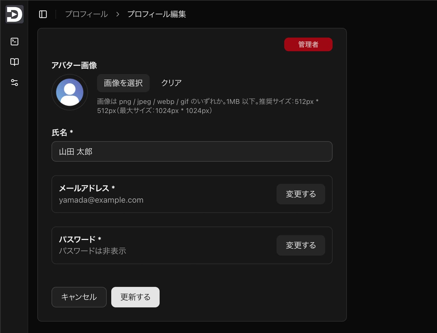
次章では、
/profile/email / /profile/password の UI も同じ要領で加えていきます。3. メールアドレス変更(/profile/email)
この章では 本人のメールアドレス変更画面 を作ります。プロフィール画面ではメールは「表示のみ」でしたが、ここで新しいメールを入力して 認証リンクを送信するところまで を UI で表現します(バックエンドは次回以降)。
仕様(UIのみ)
| 項目 | 内容 |
|---|---|
| 現在のメール | 読み取り専用で表示 |
| 新しいメール | テキスト入力(Zodで形式チェック/現在と同一ならエラー) |
| 送信ボタン | 「認証メールを送る」→ 成功トーストのみ(UI擬似) |
| バリデーション | z.email()、現在のメールと一致禁止 |
| 遷移 | パンくず・戻る導線あり(/profileへ戻れる) |
まずは下層(スキーマ)→コンポーネント→クライアント軽量ラッパー→SSRページの順で追加していきます。
txt
1// 画面イメージ
2[ /profile/email ]
3 ├─ 現在のメール: yamada@example.com(表示のみ)
4 ├─ 新しいメール: [ Input ]   (例: new@example.com)
5 └─ [ 認証メールを送る ]  [ キャンセル ]
6
7※ 送信後は「認証メールを送信しました」トースト(UIのみ)
Zodによるユーザ情報スキーマ定義へ追加
ts
1// src/lib/users/schema.ts への追記(末尾近くに追加)
2
3// …(既存の定数・スキーマは省略)…
4
5/** 追記:── プロフィール(本人用)のメール変更フォーム(本人用/確認メールを送るだけ) ── */
6export const emailChangeSchema = (currentEmail: string) =>
7  z.object({
8    newEmail: z
9      .email("メールアドレスの形式が正しくありません")
10      .refine(
11        (v) => v.trim().toLowerCase() !== currentEmail.trim().toLowerCase(),
12        "現在のメールアドレスと同じです。別のメールアドレスを入力してください",
13      ),
14  });
15
16/** 型:emailChangeSchemaが現在のメールアドレスと突合せする関数なので、ReturnType で返り値スキーマを取り出してから infer**/
17export type EmailChangeValues = z.infer<ReturnType<typeof emailChangeSchema>>;
フォームのUI構成ファイルを作成
tsx
1// src/components/profile/email-change-form.tsx
2"use client";
3
4import * as React from "react";
5import { useForm } from "react-hook-form";
6import { zodResolver } from "@hookform/resolvers/zod";
7import { emailChangeSchema, type EmailChangeValues } from "@/lib/users/schema";
8import { Button } from "@/components/ui/button";
9import {
10 Card,
11 CardContent,
12 CardFooter,
13 CardHeader,
14 CardTitle,
15 CardDescription,
16} from "@/components/ui/card";
17import {
18 Form,
19 FormField,
20 FormItem,
21 FormLabel,
22 FormControl,
23 FormMessage,
24} from "@/components/ui/form";
25import { Input } from "@/components/ui/input";
26
27/* =========================
28 公開インターフェース
29 ========================= */
30type Props = {
31 currentEmail: string; // 表示のみ
32 onSubmit: (values: EmailChangeValues) => void; // ← トーストは親(client.tsx)で
33 onCancel?: () => void;
34};
35
36/* =========================
37 本体
38 ========================= */
39export default function EmailChangeForm({
40 currentEmail,
41 onSubmit,
42 onCancel,
43}: Props) {
44 const form = useForm<EmailChangeValues>({
45 resolver: zodResolver(emailChangeSchema(currentEmail)),
46 defaultValues: { newEmail: "" },
47 mode: "onBlur",
48 });
49
50 const handleSubmit = form.handleSubmit(onSubmit);
51
52 return (
53 <Form {...form}>
54 <form onSubmit={handleSubmit} data-testid="email-change-form">
55 <Card className="w-full rounded-md">
56 <CardHeader className="pb-2">
57 <CardTitle>メールアドレスの変更</CardTitle>
58 <CardDescription>
59 新しいメールアドレス宛に認証URLを送信します。本人確認後に切り替わります。
60 </CardDescription>
61 </CardHeader>
62
63 <CardContent className="space-y-6">
64 <CurrentEmailField value={currentEmail} />
65 <NewEmailField />
66 </CardContent>
67
68 <CardFooter className="mt-2 flex gap-2">
69 <Button
70 type="button"
71 variant="outline"
72 onClick={onCancel ?? (() => history.back())}
73 className="cursor-pointer"
74 data-testid="cancel-btn"
75 >
76 キャンセル
77 </Button>
78 <Button
79 type="submit"
80 disabled={form.formState.isSubmitting}
81 className="cursor-pointer"
82 data-testid="submit-email-change"
83 >
84 認証メールを送る
85 </Button>
86 </CardFooter>
87 </Card>
88 </form>
89 </Form>
90 );
91}
92
93/* =========================
94 小さなフィールド群(同ファイル内)
95 ========================= */
96
97// 現在のメール(表示のみ)
98function CurrentEmailField({ value }: { value: string }) {
99 return (
100 <div className="rounded-md border p-3">
101 <div className="text-sm font-semibold">現在のメールアドレス</div>
102 <div className="text-muted-foreground truncate text-sm" title={value}>
103 {value}
104 </div>
105 </div>
106 );
107}
108
109// 新しいメール
110function NewEmailField() {
111 return (
112 <FormField
113 name="newEmail"
114 render={({ field }) => (
115 <FormItem>
116 <FormLabel className="font-semibold">
117 新しいメールアドレス *
118 </FormLabel>
119 <FormControl>
120 <Input
121 {...field}
122 type="email"
123 inputMode="email"
124 placeholder="new@example.com"
125 aria-label="新しいメールアドレス"
126 autoComplete="off"
127 data-testid="new-email"
128 />
129 </FormControl>
130 <FormMessage data-testid="new-email-error" />
131 </FormItem>
132 )}
133 />
134 );
135}フォーム呼び出し用の軽量ラッパー作成
tsx
1// src/app/(protected)/profile/email/client.tsx
2"use client";
3import { useRouter } from "next/navigation";
4
5import EmailChangeForm from "@/components/profile/email-change-form";
6import { mockUser } from "@/lib/sidebar/mock-user";
7import { toast } from "sonner";
8import type { EmailChangeValues } from "@/lib/users/schema";
9
10export default function EmailChangeClient() {
11  const router = useRouter();
12  // 実運用ではセッションから本人のメールを取得
13  return (
14    <EmailChangeForm
15      currentEmail={mockUser.email}
16      onSubmit={(values: EmailChangeValues) => {
17        // トースト通知
18        toast.success("認証メールを送信しました", {
19          description: `送信先:${values.newEmail}`,
20          duration: 3500,
21        });
22        // 成功したら、一覧ページへ遷移(まだ遷移先が未作成なので一旦コメントアウト
23        router.push("/profile");
24      }}
25      onCancel={() => history.back()}
26    />
27  );
28}
ユーザ情報のメールアドレス変更ページを作成
tsx
1// src/app/(protected)/profile/email/page.tsx(新規:SSR)
2import type { Metadata } from "next";
3import {
4  Breadcrumb,
5  BreadcrumbItem,
6  BreadcrumbLink,
7  BreadcrumbList,
8  BreadcrumbPage,
9  BreadcrumbSeparator,
10} from "@/components/ui/breadcrumb";
11import { Separator } from "@/components/ui/separator";
12import { SidebarTrigger } from "@/components/ui/sidebar";
13import Client from "./client";
14
15export const metadata: Metadata = {
16  title: "メールアドレス変更 | 管理画面レイアウト【DELOGs】",
17  description:
18    "本人のメールアドレス変更(認証メール送信)UI。確認URLで本人確認後に切り替え。",
19};
20
21export default async function Page() {
22  return (
23    <>
24      <header className="flex h-16 shrink-0 items-center gap-2 transition-[width,height] ease-linear group-has-data-[collapsible=icon]/sidebar-wrapper:h-12">
25        <div className="flex items-center gap-2 px-4">
26          <SidebarTrigger className="-ml-1" />
27          <Separator
28            orientation="vertical"
29            className="mr-2 data-[orientation=vertical]:h-4"
30          />
31          <Breadcrumb>
32            <BreadcrumbList>
33              <BreadcrumbItem className="hidden md:block">
34                <BreadcrumbLink href="/profile">プロフィール</BreadcrumbLink>
35              </BreadcrumbItem>
36              <BreadcrumbSeparator className="hidden md:block" />
37              <BreadcrumbItem>
38                <BreadcrumbPage>メールアドレス変更</BreadcrumbPage>
39              </BreadcrumbItem>
40            </BreadcrumbList>
41          </Breadcrumb>
42        </div>
43      </header>
44
45      <div className="max-w-xl p-4 pt-0">
46        <Client />
47      </div>
48    </>
49  );
50}
補足・運用メモ(次回以降のバックエンドで実装)
- 送信時に 認証トークン を作成し、
newEmailと紐付けて保存(期限付き)。 - トークン付き URL を
newEmailへ送信。クリックで本人確認 →emailを確定変更。 - 確定までの間は 現在のメールを有効 のままにする(ログイン影響を避ける)。
- UIは今回のままで差し替え可能。
startEmailChangeサーバアクションを後から作成して、onSubmitに置き換えればOK。
npm run devで/profile/emailへアクセスすると下記のような画面になります。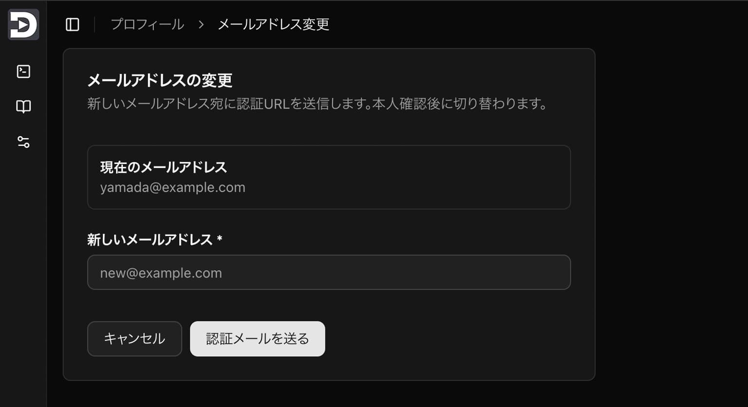
これで /profile/email の UI 一式が完成です。次章は /profile/password を同じ流れで実装していきます。
4. パスワード変更フォーム(/profile/password)
本人専用のパスワード変更画面を追加します。
/ users 系と同じ流儀で、スキーマ(Zod) → コンポーネント → client.tsx → page.tsx(SSR) の順で作成。
ご要望どおり、入力欄は 「現在のパスワード」と「新しいパスワード」だけ(確認用なし)です。
トースト通知は
/ users 系と同じ流儀で、スキーマ(Zod) → コンポーネント → client.tsx → page.tsx(SSR) の順で作成。
ご要望どおり、入力欄は 「現在のパスワード」と「新しいパスワード」だけ(確認用なし)です。
トースト通知は
/profile/password/client.tsx 側で行い、フォーム本体では行いません。仕様(UIのみ)
- フィールド
- 現在のパスワード(必須・非表示/表示トグル)
- 新しいパスワード(必須・非表示/表示トグル・
PASSWORD_MIN以上、英大/小/数字を各1文字以上)
- ボタン
- キャンセル(
history.back()) - 変更する(UIのみ成功トースト →
/profileに戻す)
- キャンセル(
- バリデーション
src/lib/users/schema.tsにpasswordChangeSchemaを追記PasswordChangeValues型をエクスポート
- コードスタイル
- 小さなフィールド群は 同ファイル末尾にまとめ、フォーム側では
<CurrentPasswordField />のように呼び出す - Eye/EyeOff のトグルを各フィールドに実装
- 小さなフィールド群は 同ファイル末尾にまとめ、フォーム側では
txt
1# 追加・変更ファイル
2
3src/
4├─ lib/
5│  └─ users/
6│     └─ schema.ts                         # (追記)passwordChangeSchema / PasswordChangeValues
7├─ components/
8│  └─ profile/
9│     └─ password-change-form.tsx          # (新規)フォーム本体
10└─ app/
11   └─ (protected)/
12      └─ profile/
13         └─ password/
14            ├─ client.tsx                  # (新規)軽量ラッパー(成功トースト+/profileへ)
15            └─ page.tsx                    # (新規)SSR(ヘッダ/Breadcrumb)
Zodによるユーザ情報スキーマ定義へ追加
src/lib/users/schema.tsへ下記を追記します。ts
1// src/lib/users/schema.ts(追記部分のみ)
2
3/** ── パスワード変更(本人) ─────────────────── */
4export const passwordChangeSchema = z.object({
5  currentPassword: z.string().min(1, "現在のパスワードを入力してください"),
6  newPassword: passwordSchema, // 共通化したものを利用,
7});
8
9export type PasswordChangeValues = z.infer<typeof passwordChangeSchema>;
フォームのUI構成ファイルを作成
src/components/profile/password-change-form.tsxを新規作成します。tsx
1// src/components/profile/password-change-form.tsx(新規)
2"use client";
3
4import * as React from "react";
5import { useForm } from "react-hook-form";
6import { zodResolver } from "@hookform/resolvers/zod";
7import {
8 passwordChangeSchema,
9 type PasswordChangeValues,
10 PASSWORD_MIN,
11} from "@/lib/users/schema";
12
13import { Eye, EyeOff } from "lucide-react";
14
15import { Button } from "@/components/ui/button";
16import { Card, CardContent, CardFooter } from "@/components/ui/card";
17import {
18 Form,
19 FormControl,
20 FormField,
21 FormItem,
22 FormLabel,
23 FormMessage,
24} from "@/components/ui/form";
25import { Input } from "@/components/ui/input";
26
27/* =========================
28 公開インターフェース
29 ========================= */
30type Props = {
31 onSubmit: (values: PasswordChangeValues) => void; // ← client.tsx でトースト&遷移
32 onCancel?: () => void;
33};
34
35/* =========================
36 本体
37 ========================= */
38export default function PasswordChangeForm({ onSubmit, onCancel }: Props) {
39 const form = useForm<PasswordChangeValues>({
40 resolver: zodResolver(passwordChangeSchema),
41 defaultValues: { currentPassword: "", newPassword: "" },
42 mode: "onBlur",
43 });
44
45 const handleSubmit = form.handleSubmit((values) => {
46 // ※ このコンポーネント内ではトーストしない(/profile/email と同じ方針)
47 onSubmit(values);
48 });
49
50 return (
51 <Form {...form}>
52 <form onSubmit={handleSubmit} data-testid="password-change-form">
53 <Card className="w-full rounded-md">
54 <CardContent className="space-y-6 pt-4">
55 <CurrentPasswordField />
56 <NewPasswordField />
57 </CardContent>
58
59 <CardFooter className="mt-2 flex gap-2">
60 <Button
61 type="button"
62 variant="outline"
63 onClick={onCancel}
64 className="cursor-pointer"
65 data-testid="cancel-btn"
66 >
67 キャンセル
68 </Button>
69 <Button
70 type="submit"
71 className="cursor-pointer"
72 disabled={form.formState.isSubmitting}
73 data-testid="submit-password"
74 >
75 変更する
76 </Button>
77 </CardFooter>
78 </Card>
79 </form>
80 </Form>
81 );
82}
83
84/* =========================
85 小さなフィールド群(同ファイル内)
86 ========================= */
87
88// 現在のパスワード
89function CurrentPasswordField() {
90 const [visible, setVisible] = React.useState(false);
91
92 return (
93 <FormField
94 name="currentPassword"
95 render={({ field }) => (
96 <FormItem>
97 <FormLabel className="font-semibold">
98 現在のパスワード *
99 </FormLabel>
100 <div className="flex items-start gap-2">
101 <FormControl>
102 <Input
103 {...field}
104 type={visible ? "text" : "password"}
105 autoComplete="off"
106 aria-label="現在のパスワード"
107 data-testid="current-password"
108 />
109 </FormControl>
110 <Button
111 type="button"
112 size="icon"
113 variant="outline"
114 onClick={() => setVisible((v) => !v)}
115 aria-label={
116 visible ? "パスワードを非表示にする" : "パスワードを表示する"
117 }
118 className="shrink-0 cursor-pointer"
119 data-testid="current-password-toggle"
120 >
121 {visible ? (
122 <EyeOff className="size-4" />
123 ) : (
124 <Eye className="size-4" />
125 )}
126 </Button>
127 </div>
128 <FormMessage data-testid="current-password-error" />
129 </FormItem>
130 )}
131 />
132 );
133}
134
135// 新しいパスワード
136function NewPasswordField() {
137 const [visible, setVisible] = React.useState(false);
138
139 return (
140 <FormField
141 name="newPassword"
142 render={({ field }) => (
143 <FormItem>
144 <FormLabel className="font-semibold">
145 新しいパスワード *
146 </FormLabel>
147 <div className="flex items-start gap-2">
148 <FormControl>
149 <Input
150 {...field}
151 type={visible ? "text" : "password"}
152 autoComplete="off"
153 placeholder={`${PASSWORD_MIN}文字以上(英大/小/数字を含む)`}
154 aria-label="新しいパスワード"
155 data-testid="new-password"
156 />
157 </FormControl>
158 <Button
159 type="button"
160 size="icon"
161 variant="outline"
162 onClick={() => setVisible((v) => !v)}
163 aria-label={
164 visible ? "パスワードを非表示にする" : "パスワードを表示する"
165 }
166 className="shrink-0 cursor-pointer"
167 data-testid="new-password-toggle"
168 >
169 {visible ? (
170 <EyeOff className="size-4" />
171 ) : (
172 <Eye className="size-4" />
173 )}
174 </Button>
175 </div>
176 <FormMessage data-testid="new-password-error" />
177 </FormItem>
178 )}
179 />
180 );
181}フォーム呼び出し用の軽量ラッパー作成
src/app/(protected)/profile/password/client.tsxを新規作成します。tsx
1// src/app/(protected)/profile/password/client.tsx(新規)
2"use client";
3
4import { useRouter } from "next/navigation";
5import PasswordChangeForm from "@/components/profile/password-change-form";
6import { toast } from "sonner";
7
8export default function PasswordChangeClient() {
9  const router = useRouter();
10
11  return (
12    <div className="max-w-xl p-4 pt-0">
13      <PasswordChangeForm
14        onSubmit={() => {
15          // UIのみ:成功トースト → /profile へ遷移
16          toast.success("パスワードを変更しました", {
17            description: "次回ログインから新しいパスワードをご利用ください。",
18            duration: 3500,
19          });
20          router.push("/profile");
21        }}
22        onCancel={() => history.back()}
23      />
24    </div>
25  );
26}
パスワード変更ページの作成
src/app/(protected)/profile/password/page.tsxを新規作成します。tsx
1// src/app/(protected)/profile/password/page.tsx(新規:SSR)
2import type { Metadata } from "next";
3import {
4  Breadcrumb,
5  BreadcrumbItem,
6  BreadcrumbLink,
7  BreadcrumbList,
8  BreadcrumbPage,
9  BreadcrumbSeparator,
10} from "@/components/ui/breadcrumb";
11import { Separator } from "@/components/ui/separator";
12import { SidebarTrigger } from "@/components/ui/sidebar";
13import Client from "./client";
14
15export const metadata: Metadata = {
16  title: "パスワード変更 | 管理画面レイアウト【DELOGs】",
17  description:
18    "本人のパスワード変更UI(現在のパスワードと新しいパスワードのみ)。",
19};
20
21export default async function Page() {
22  return (
23    <>
24      <header className="flex h-16 shrink-0 items-center gap-2 transition-[width,height] ease-linear group-has-data-[collapsible=icon]/sidebar-wrapper:h-12">
25        <div className="flex items-center gap-2 px-4">
26          <SidebarTrigger className="-ml-1" />
27          <Separator
28            orientation="vertical"
29            className="mr-2 data-[orientation=vertical]:h-4"
30          />
31          <Breadcrumb>
32            <BreadcrumbList>
33              <BreadcrumbItem className="hidden md:block">
34                <BreadcrumbLink href="/profile">プロフィール</BreadcrumbLink>
35              </BreadcrumbItem>
36              <BreadcrumbSeparator className="hidden md:block" />
37              <BreadcrumbItem>
38                <BreadcrumbPage>パスワード変更</BreadcrumbPage>
39              </BreadcrumbItem>
40            </BreadcrumbList>
41          </Breadcrumb>
42        </div>
43      </header>
44      <div className="max-w-xl p-4 pt-0">
45        <Client />
46      </div>
47    </>
48  );
49}
補足
- client.tsx でトースト:成功トーストや遷移は
client.tsxに集約。 - 小さなフィールド群:既存の
user-form.tsxと同じ書き方(末尾定義+<XxxField />呼び出し)を踏襲。 - バリデーション:
schema.tsにスキーマを集約。PasswordChangeValuesを型として公開。 - 現在のパスワード: バックエンド開発時にチェック機能を実装想定。
npm run devで/profile/passwordへアクセスすると下記のような画面になります。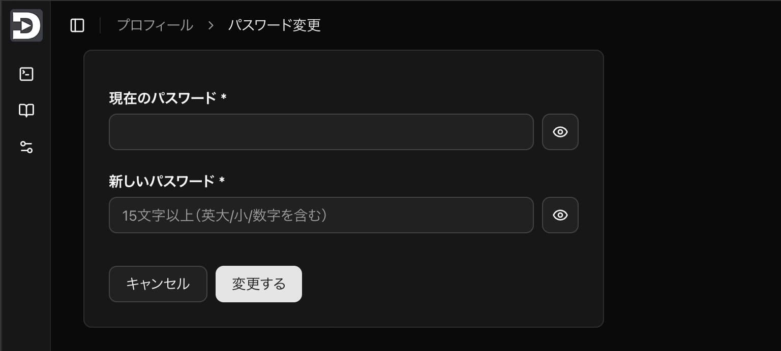
5. サイドバーパーツのユーザ情報メニューに遷移先設定
src/components/sidebar/nav-user.tsxに「ユーザー情報確認」「パスワード変更」のドロップダウンメニューがあります。
これのリンク先を今回作成した画面へ設定します。tsx
1// src/components/sidebar/nav-user.tsx(該当箇所のみ抜粋)
2
3            <DropdownMenuGroup>
4              <DropdownMenuItem asChild>
5                {/* 変更: /profile に差し替え */}
6                <a href="/profile" className="flex items-center gap-2">
7                  <UserIcon className="size-4" />
8                  ユーザー情報確認
9                </a>
10              </DropdownMenuItem>
11
12              <DropdownMenuItem asChild>
13                {/* 変更: /profile/password に差し替え */}
14                <a href="/profile/password" className="flex items-center gap-2">
15                  <KeyRound className="size-4" />
16                  パスワード変更
17                </a>
18              </DropdownMenuItem>
19
20              <DropdownMenuItem asChild>
21                {/* TODO: /notifications に差し替え予定 */}
22                <a href="#" className="flex items-center gap-2">
23                  <Bell className="size-4" />
24                  通知
25                </a>
26              </DropdownMenuItem>
27            </DropdownMenuGroup>
これで、サイドバーから変更画面への導線が設定できました。今回の目標は達成です。
6. まとめと次回予告
今回の記事では、ログインユーザ本人が利用する プロフィール関連のUI を実装しました。
ページ構成は
ページ構成は
/profile を起点として「氏名・アバター編集」「メールアドレス変更」「パスワード変更」へとつながり、利用者が自分自身の情報を管理できる流れを整えています。実装上のポイントは、フォーム本体は UI に専念させ、トースト通知や画面遷移は client.tsx 側に任せたことです。これにより、
さらに、バリデーション仕様は
/users 系と /profile 系でスタイルが統一され、見通しが良くなりました。さらに、バリデーション仕様は
schema.ts にまとめており、異なる画面でも同じルールを再利用できる構成になっています。なお、今回のコードはあくまで UI のみですが、将来的には以下のような拡張が想定されています。
/profile/emailでは、入力された新しいメール宛に認証トークンを送信し、確認が取れた時点でDB更新を行う。/profile/passwordでは、現在のパスワードをサーバ側で照合し、正しい場合のみ新しいハッシュ値を保存する。
こうしたサーバ側の処理を組み込むことで、本番環境に耐えうる仕組みへ発展させられます。
次回は マスタ管理(管理者向け) に進みます。
対象は「ロール管理」で、以下を扱う予定です。
対象は「ロール管理」で、以下を扱う予定です。
- 一覧表示(検索・ページング対応)
- 新規登録フォーム
- 既存ロールの編集
- 削除処理(確認ダイアログ付き)
これにより、管理画面全体で利用するロール情報を DB で柔軟に管理 できるようになります。
参考文献
Githubリポジトリ
この記事で作成した内容は下記のGithubリポジトリにアップしています。ご参考にどうぞ。
この記事の執筆・編集担当
DE
松本 孝太郎
DELOGs編集部/中年新米プログラマー
ここ数年はReact&MUIのフロントエンドエンジニアって感じでしたが、Next.jsを学んで少しずつできることが広がりつつあります。その実践記録をできるだけ共有していければと思っています。
この記事の更新履歴
2025/8/23
Githubリポジトリのリンクを追加
2025/8/21
初回公開
▼ 関連記事
[管理画面フォーマット制作編 #9] Shadcn/ui で作る管理画面フォーマット ─ デモ公開とカスタマイズ方法
これまで進めてきたログイン画面、ユーザー管理、ロール管理、サイドバー管理などをまとめ、「UIのみ版」デモを公開
2025/9/3公開
![[管理画面フォーマット制作編 #9] Shadcn/ui で作る管理画面フォーマット ─ デモ公開とカスタマイズ方法のイメージ](/_next/image?url=%2Farticles%2Fnext-js%2Fdashboard-format-ui-demo%2Fhero-thumbnail.jpg&w=1200&q=75&dpl=dpl_EDkazoJ2F23U22ccjw3z3ZjTF1EH)
[管理画面フォーマット制作編 #8] ログイン後404ページ + ログイン前のパスワード忘れ導線UI
管理画面に「ログイン後の404ページ」と、ログイン前にユーザが管理者へ依頼できる「パスワード忘れ導線UI」を追加
2025/9/1公開
![[管理画面フォーマット制作編 #8] ログイン後404ページ + ログイン前のパスワード忘れ導線UIのイメージ](/_next/image?url=%2Farticles%2Fnext-js%2Fformat-404-password-forgot%2Fhero-thumbnail.jpg&w=1200&q=75&dpl=dpl_EDkazoJ2F23U22ccjw3z3ZjTF1EH)
[管理画面フォーマット制作編 #7] サイドバーメニュー管理UI ─ 3層・並び順・priority可視制御まで
サイドバーに表示するメニューをUIから登録・編集・削除できる管理画面を作成
2025/8/28公開
![[管理画面フォーマット制作編 #7] サイドバーメニュー管理UI ─ 3層・並び順・priority可視制御までのイメージ](/_next/image?url=%2Farticles%2Fnext-js%2Fformat-menu-ui%2Fhero-thumbnail.jpg&w=1200&q=75&dpl=dpl_EDkazoJ2F23U22ccjw3z3ZjTF1EH)
[管理画面フォーマット制作編 #6] マスタ管理-ロール管理(UIのみ)
ロールテーブルを管理画面から操作するためのUIを、Next.js 15 + shadcn/ui + React Hook Form + Zodで実装
2025/8/25公開
![[管理画面フォーマット制作編 #6] マスタ管理-ロール管理(UIのみ)のイメージ](/_next/image?url=%2Farticles%2Fnext-js%2Fformat-role-ui%2Fhero-thumbnail.jpg&w=1200&q=75&dpl=dpl_EDkazoJ2F23U22ccjw3z3ZjTF1EH)
[管理画面フォーマット制作編 #4] サイドバーのメニューと参照中ページの同期
Next.js App Router + shadcn/ui のサイドバーで「いま見ているページ」を正しくハイライト
2025/8/18公開
![[管理画面フォーマット制作編 #4] サイドバーのメニューと参照中ページの同期のイメージ](/_next/image?url=%2Farticles%2Fnext-js%2Fsidebar-active-sync%2Fhero-thumbnail.jpg&w=1200&q=75&dpl=dpl_EDkazoJ2F23U22ccjw3z3ZjTF1EH)